returning to origins
it’s in our nature to uncover authentic narratives behind visual identities. this is critical to our design process as it gives us and our clients a solid footing on which to then make all future decisions.
in the spirit of the first london coffee bar being named after the origins of coffee transport and trading, we want to take you on a journey through the cultural movements of the 50s and look at why this bar was a zeitgeist of the time, not just a happy accident.
the 50s were showing a leaning toward a natty continental style, with icons such as alain delon and audrey hepburn. chanel was having a resurgence and mid- century design was full proved as a reaction to the over ornamentation of 19th century design excesses.
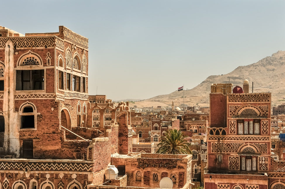
yemen origins
the primitive and functional architecture of the yemen region has long inspired architects and planners. the sustainability and pure use of and respect for natural, local materiality is unmistakable.
rammed earth, mud clay and lime plaster all blend into a beautiful sun-bleached mass of partially abstract, partially formed dwellings, almost rock formations springing from the barren topography and becoming one with the land.
we have partially based our restrained colour palette on this ethical and ancient form of architecture – the monolithic forms from the distant past now strikingly relevant in modern design.
mid-century
rather than looking at the cliched and so-called mid-century design that has been overused in hospitality, we have gone straight to the heart of the true movers and shakers of the time, the thinkers, architects, movements, and avant-garde artists of the 40s and 50s, seeking out the ideas that have become timeless and indeed the foundations for contemporary design. modernist design provides a way into a dynamic, striking design, with clean pure forms, a pleasing mix of natural materials and refined elegance, with a sound understanding of restraint and harmony. this is where we proposed we begin the foundations of our concept for moka; taking this way of thinking and creating a sounds architectural based design that will engage our intelligent and culturally savvy target audience who have exposure to high end design through social media and other successful brands.
logo
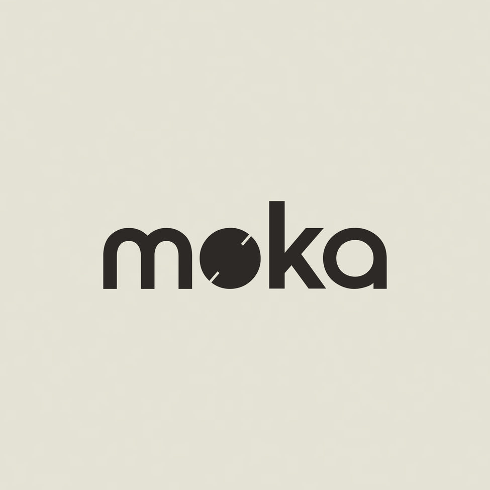
having to develop the logo due to trademarked conflicts has resulted in this stroke of perfection. the word is clear, clean, and readable, with no awkward weights or imbalance outside of each letter. And trademarked. the font is based on geometric sans serif typeface typical of the mid 20th century, with a simplicity and timelessness that will result in sophisticated and elegant usage.
the two slots cut into the ‘o’ draw on a couple of consistent narratives – both the abstracted form of a coffee bean, and the carlo scarpa inspired detailing we have worked into this space in homage of the great architects of the modernist and mid-century era.
the circular form of this ‘o’ can be extrapolated as an endlessly translatable icon and the symbology of a circle is powerful, with relatable connotations such as:
sacred geometry, proportions, wholeness, timelessness, circular economy, wellbeing, eternity, life energy sustainability.